Graphics and Visuals: Devlog #2
Welcome Back
Writing the first devlog was an absolute joy. I don't think I've ever been this motivated to work on a such long-term project (I guess the game is alright to work on too). This type of formative writing is also something I really enjoy doing, and for me personally, it works wonders for my motivation and enjoyment. I won't say that it necessarily works for everyone, but I will say that it is worth trying throughout different mediums. I'm probably crazy for enjoying formative essay writing, but videos are also a great medium for showing off your work and explaining your process. You could even go wild with it; maybe make a comic, website, or discussion board! Showing off your work and discussing it, even if it turns out to be terrible, is likely to be helpful and healthy in the long term. I've been working on this game for a couple months now, and I haven't lost a bit of motivation to work on it since then. Now, lets get into the terrible things I'd like to show off and discuss. For this post, I want to focus on the more visual aspects of my game: the graphics, and the environment/setting that the game takes place in.
Visuals and Clarity
What exactly does it mean when a game has 'good' visuals? If you asked most players, they would likely say it's the level of graphical detail or realism on display within the game. However, when you look at many popular indie titles, the answer starts to seem... not so simple. Pixel art is quite the opposite of realism. It's clear that art doesn't have to be realistic or even entirely cohesive to be "good". We can apply this same logic to other art forms as well. Would the art of Vincent Van Gogh be as famous as it is today if we still judged paintings by their level of detail and realism? In fact, Van Gogh is famous for removing detail from his art, and yet, our eyes can still see his paintings with the clarity of photographs.
Pixel art follows the exact same artistic principals as Van Gogh in that sense. In my opinion, a game's visuals being "good" means that they have to present the game and its style to the audience with clarity. This doesn't mean we should invest in 4K textures and ray tracing until half the audience can't even run games on modern hardware anymore, it means that graphics need to coexist with the gameplay in a way that gets as many necessary artistic ideas across as possible. I'm not arguing that realistic graphics are bad, I'm arguing that graphics should only be realistic when that realism is a core element of the game and its mechanics. I personally prefer to play Skyrim over Oblivion, not because I think that Skyrim has more in-depth gameplay mechanics (it doesn't), but because the setting is represented in a much better way through the medium of visuals. The stylistic realism when combined with the music and sound design evokes nostalgia and the feeling of being in the wilderness. This directly motivates me to explore; Skyrim to me simply feels like a more interesting world to be in purely on the front of aesthetic elements. Although, my biggest critique of the game as a whole would be how homogonous the different caverns can feel at times. The constant reuse of assets does seem to detract from my desire to explore everything.
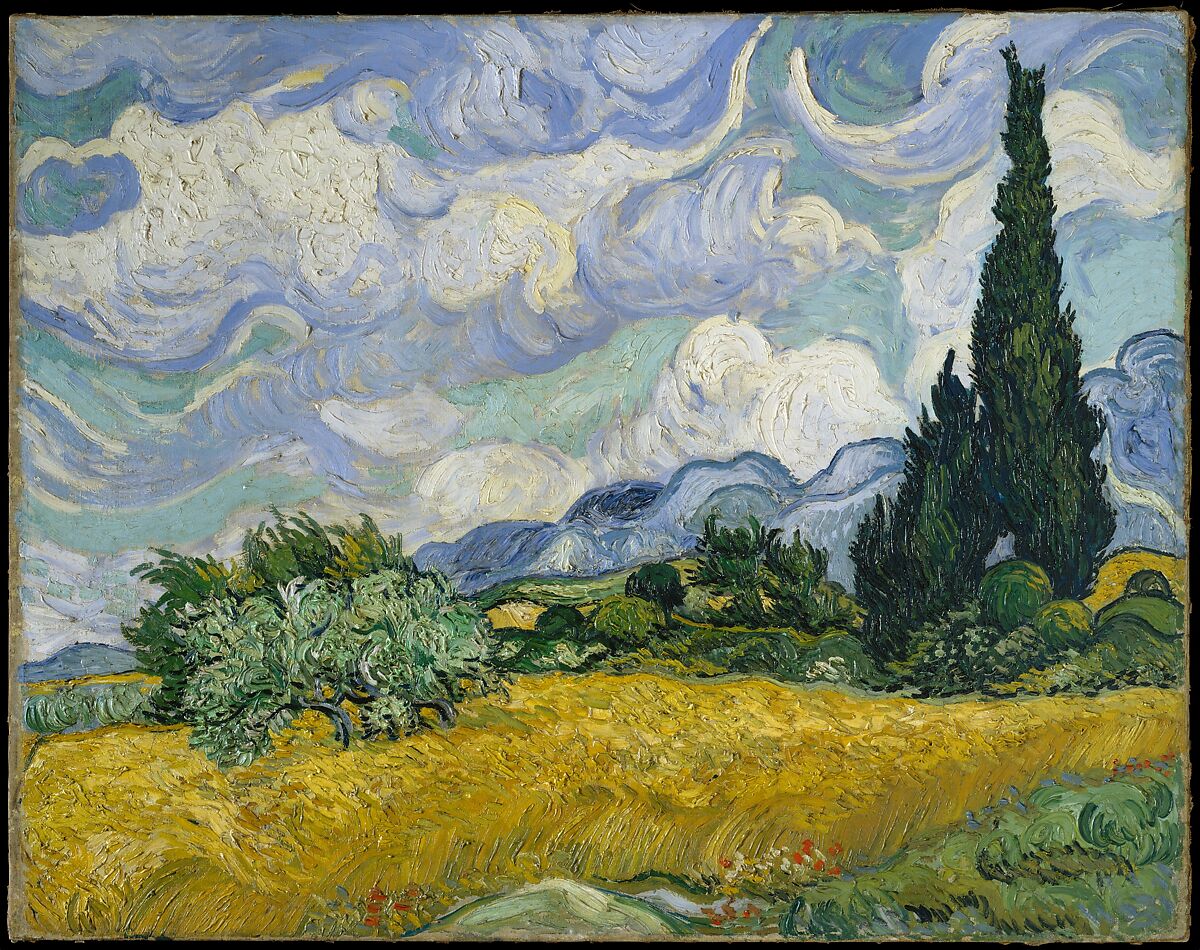
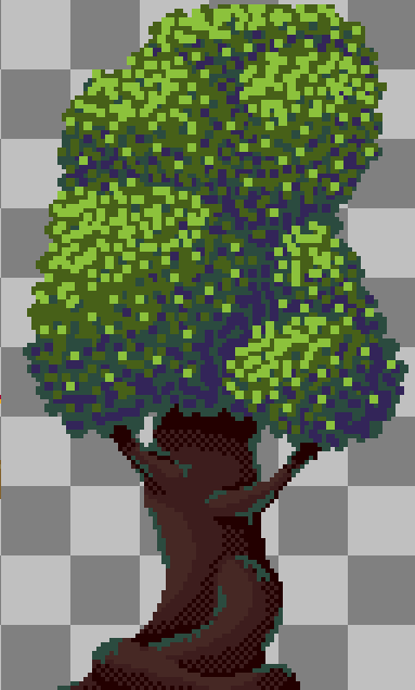
My tree actually looks really terrible alongside Wheat Field with Cypresses now that I've put them here side-by-side.
On the opposite end of the realism spectrum, I would also say that Risk of Rain has good graphics. Being a pixel art game, and a very low-resolution one at that, Risk of Rain Returns communicates its visual ideas nearly perfectly. The main character, being only a few pixels in size, sits at the vertical center of your screen at all times, tiny. The landscape and background are much larger than you, and so are many of the enemies. These framing decisions are meant to communicate to the player the feeling of standing in a vast landscape on a distant planet, and they do this well. This framing was kept in the game's remake, Risk of Rain Returns, which communicate all of the ideas from the original game with even more clarity. However, the level of detail in the characters and entities remain purposefully low. Adding "more" to the graphics of Risk of Rain would detract from the experience significantly, as the framing wouldn't work anymore.
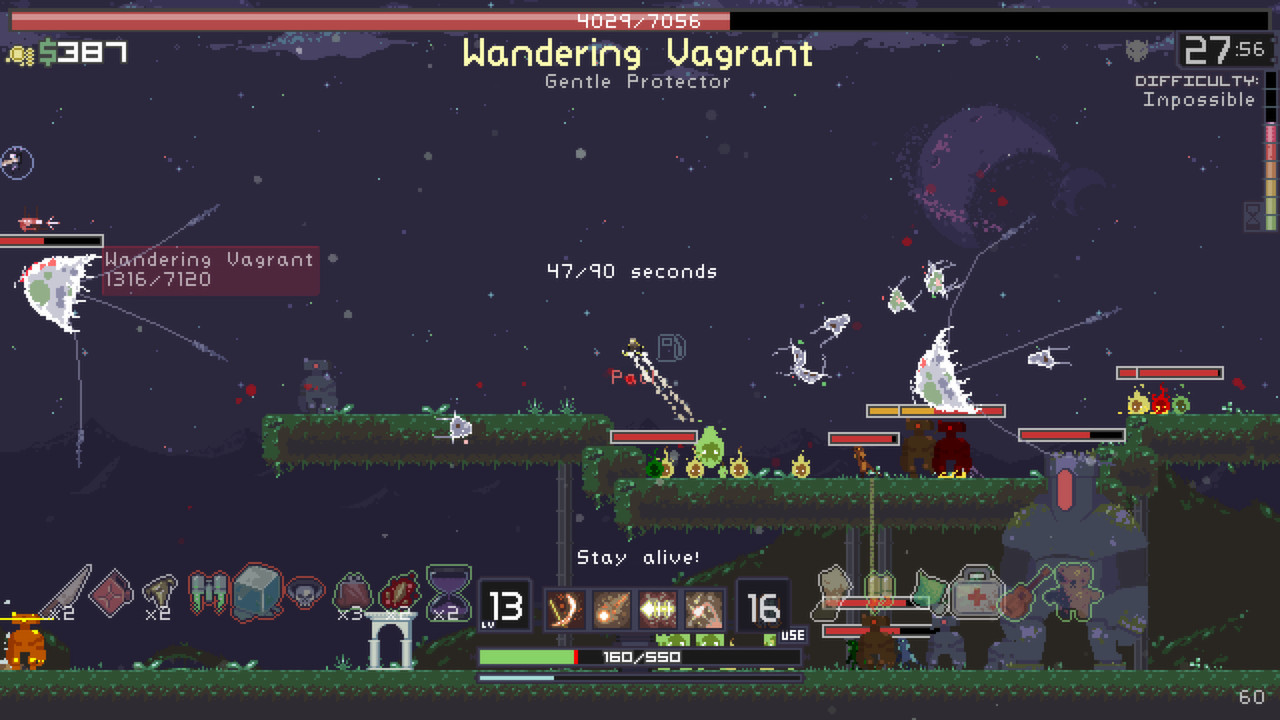
You wouldn't even be able to see the character here if she wasn't at the very center of the screen. That's (probably) intentional too.
So, how am I planning to accomplish (relatively) good visuals with Enchanterland? Well, one of the main tools I am using to communicate the fuzzy feelings of fairy tales is color. In making the tileset for the first environment, the thing I paid the most attention to was the color palette. I wanted every color in the limited but diverse palette to contrast well with the other ones, sort of in the same way that the colors on a Van Gogh painting would. I'm not too experienced of a pixel artist, since I tend to focus more on other game-design elements, but the application of color was really important to me. If I got that right, I could then get away with the art being reasonably messy in other areas. After all, the pixel art in the original Risk of Rain was extremely messy, but it still worked very well. The textures of Minecraft aren't exactly pixel art genius either, but they convey the messages that they want to convey.
Even though these sprites are fairly messy, I think the colors generally make up for that.
Animation is also something that is very important to me. If a picture paints a thousand words, an effective animation paints a novel. In particular, I deeply enjoy trying to convey the strength of an attack through the medium of animation. Masahiro Sakurai, the director of the Super Smash Brothers series, has talked about his methods of going about attack animation in his "hit" fighting game franchise (see what I did there?). Every attack can be divided into a few parts: first, there's the Lead-In: this shows the character getting ready and charging the strike. If you've played darts, you can think of this as the point where you pull the dart beside your ear to build up momentum for a solid throw. After that, there's the Attack, which is the time-frame while the character is actually swinging and the point when the dart leaves your hand. Finally, there's the Follow-Through: all that momentum that your character and your hand have built up has to go somewhere, so this is the point where they slow down in order to get back into an idle position. Sakurai also mentions that the attack animations in Super Smash Brothers are generally built from the idle animations as starting points.

The Kobold pulls the dagger back for the lead-in, swings it for the attack, and then quickly follows through back to the idle stance.
Color and animation are the two most-important graphical aspects of my game to me. When it comes to making Enchanterland look "good", they will be my two main tools for accomplishing such. However, just having a game that looks good isn't enough. What "good" are graphics on bland character designs or empty environments?
Characters and Setting
The details in visuals are clearly important for communicating artistic ideas to the player, but settings might be even more important. However, you probably already have a good idea as to why. Even something like Henry Stickmin, a series where every character is quite literally just a stick-figure, understands the inherent importance of characters and settings. Characters in Henry Stickmin are expressive and show a surprising amount of personality despite still just being stick-figures. They also exist in an expansive number of settings that are constantly being swapped in and out of the player's view. The entire series is essentially defined by the question of "where will we end up next?" That premise only works because most if not all of the settings in the series are well-designed and worth seeing.
Seriously, the visuals in a dated comedy game about stick people should not be this good.
When designing the characters and settings of your game, you can easily follow the same principals as I mentioned you would with the general game visuals. Having more detail isn't as important as ensuring you communicate the ideas you want to towards the player. For example, in the case of character design, understanding how different shapes influence a viewer's perspective of a character is very important. Circles often give off the impression that a character is soft and cute. Squares and rectangles can show that a character is strong and protective. Finally, triangles will usually indicate that a character is agile and dangerous. Of course, this doesn't mean the shapes on your characters have to be perfect circles, rectangles, or triangles; a character having pointy shoulders can still evoke the same impression that a triangle would. I designed my first player character primarily around circles and squares, more the first than the second. There are no actual full circles in the design (and technically there are a lot of perfect squares), but I still tried to form the illusion of rounded edges to mimic the spherical shape. The sharp unicorn horn on his helmet can also show that even he, to some extent, is a warrior.
Settings are a little bit harder. I'm not entirely sure how to make spectacular settings myself, but that's something I can learn with practice, plus trial and error. As of right now, I am able to draw individual parts of the environment somewhat well, but putting them together to form a full-on setting is... not trivial. Environment and level design is still something I want to focus on, but it'll take more work for me to get it down. Maybe in a future devlog, I'll be able to post some of my thoughts about it from personal testimony. Level design in a platformer is entirely its own thing anyways, and that has no place under the theme of this devlog entry.
I've run out of ideas for now, and I don't want to make these posts too too long anyways. My goal is to post a log every Wednesday until I either get the project done or have entirely run out of things to talk about. For those of you hoping to play it, I am also shooting to post a very small demo within the next couple weeks containing a small testing level with some very basic aspects of the game. I started this log quite a bit after I started this project, so I'm a lot farther ahead than these essays might suggest. I'll (not really) see you all here next Wednesday, as long as my attention span remains in-tact and my organs remain functional. Toodaloo.
Leave a comment
Log in with itch.io to leave a comment.